
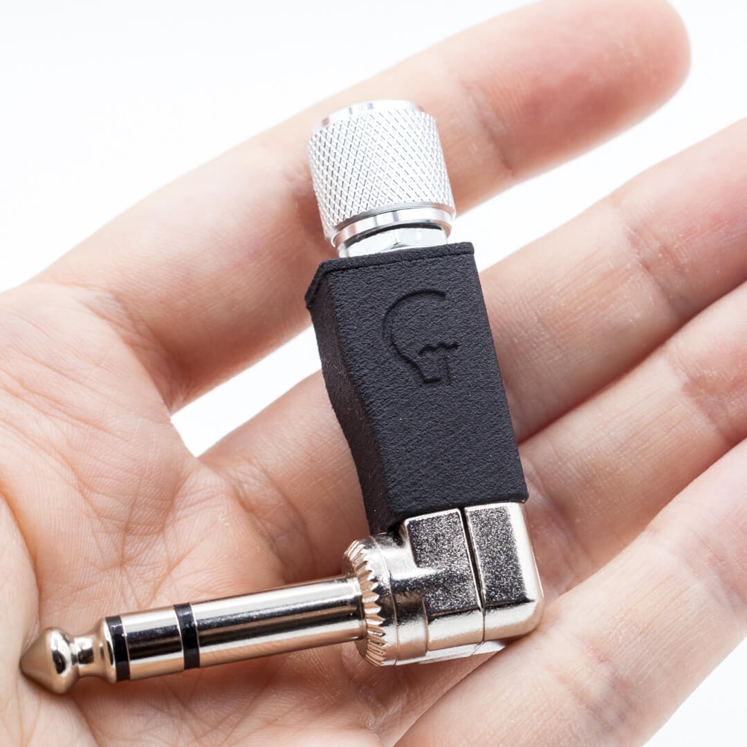
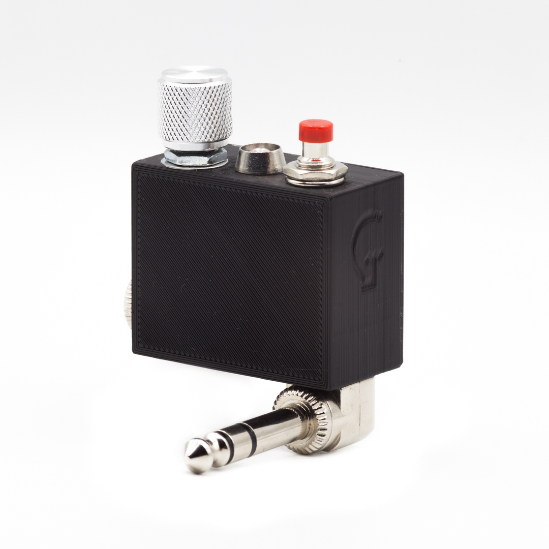
Expression Knob
The smallest expression “pedal”.
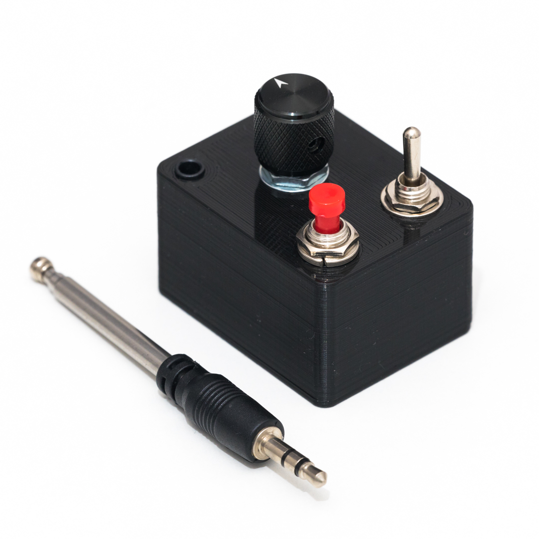
Tripl3X
Experimental expression pedal.
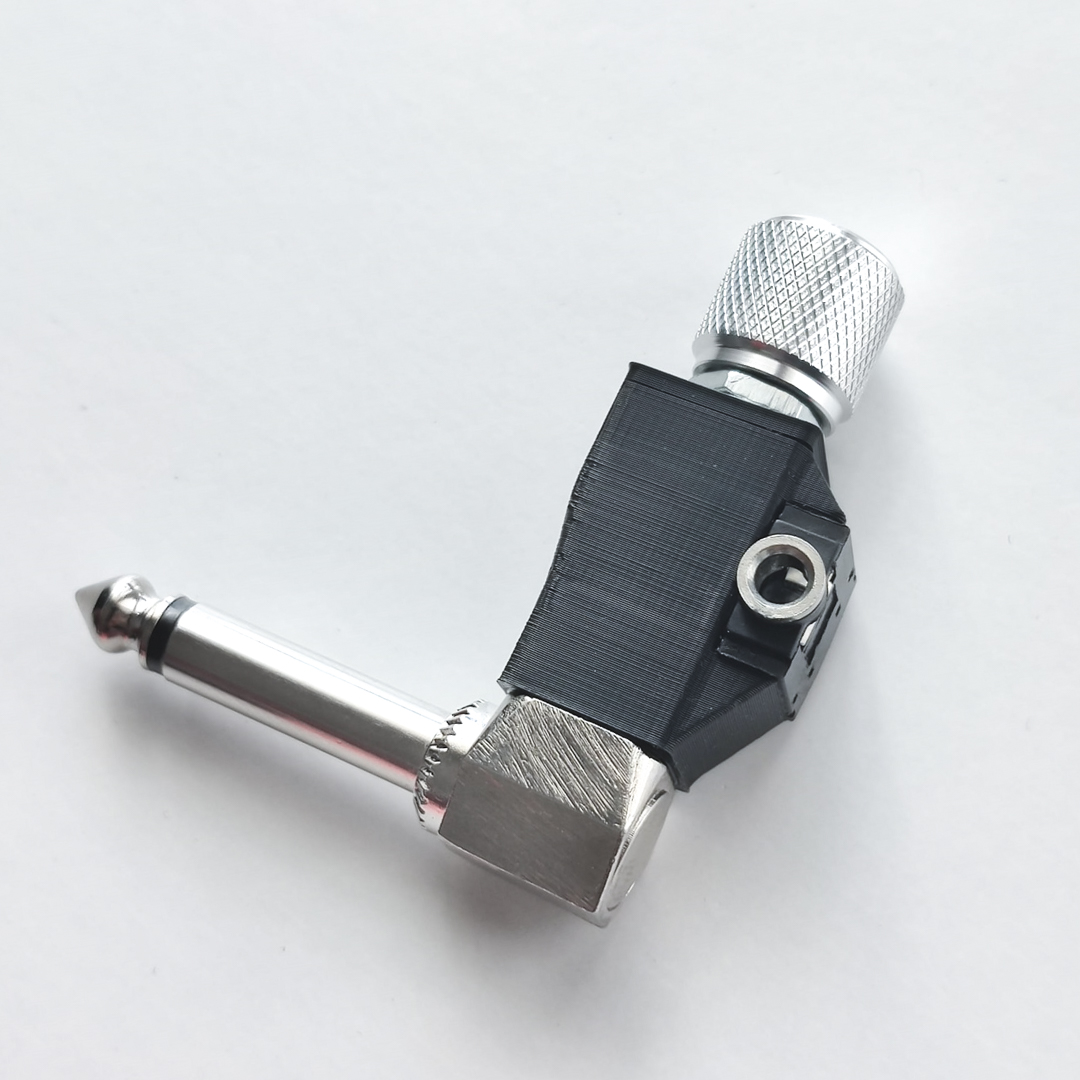
Attenuator Knob
Minimalistic volume attenuator.
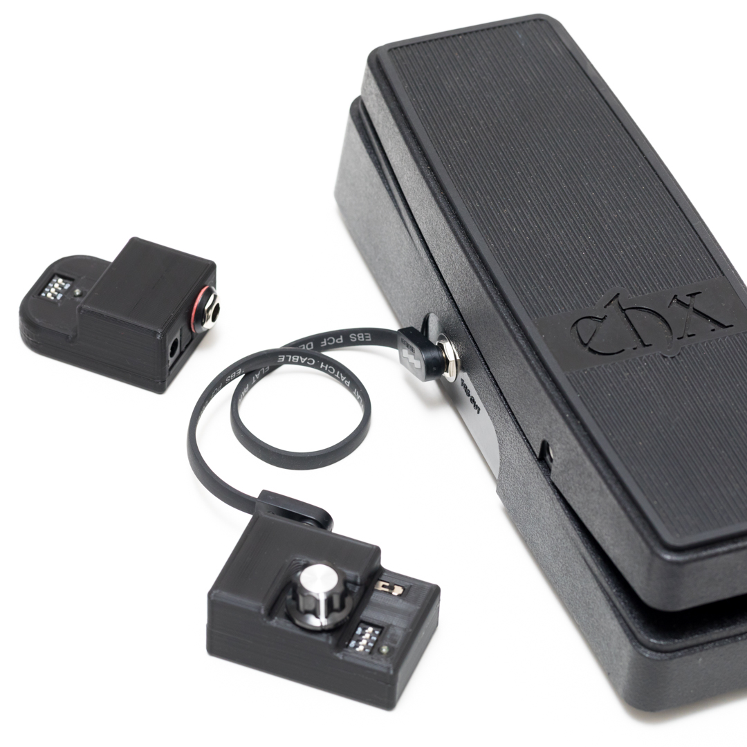
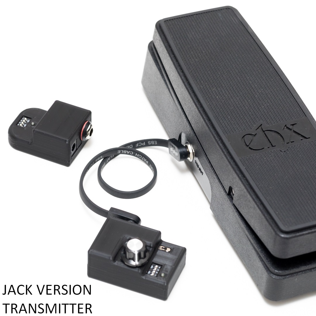
Wireless Expression (WEX)
Control your pedal’s expression wirelessly.

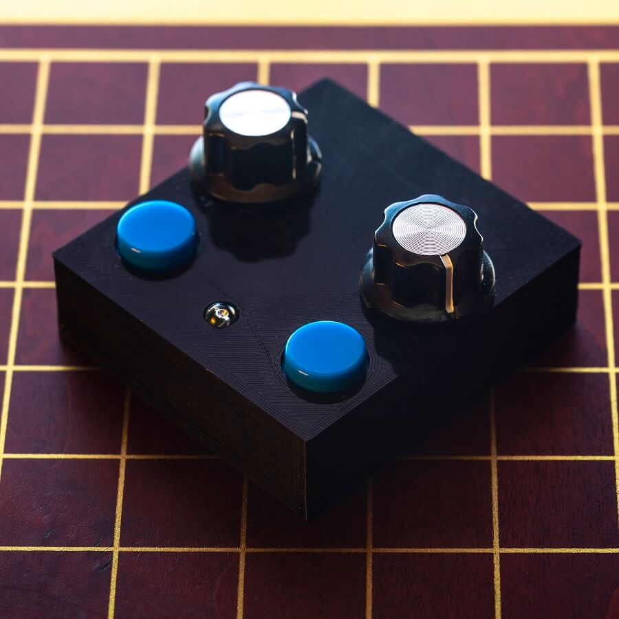
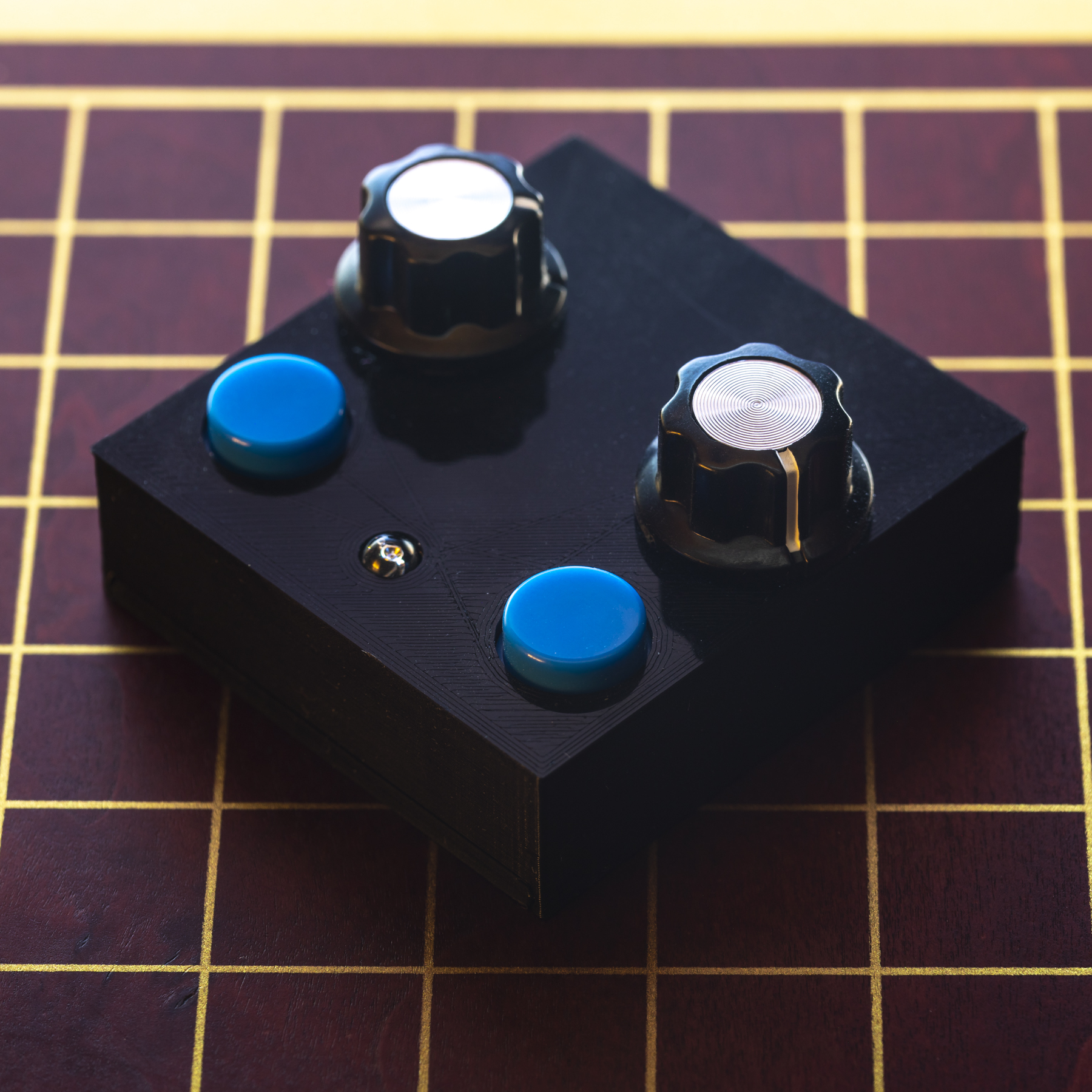
Echo Knob
Expression LFO (ramping) with depth, speed, 3 wave shapes and possibility to rec knob movements.
Thermae Time Knob
A Time Knob for your Thermae pedal.

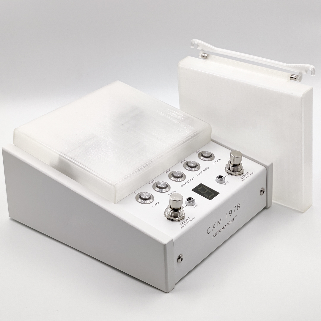
CXM Dust Cover
Detachable Chase Bliss Automatones translucent dust cover with magnets.
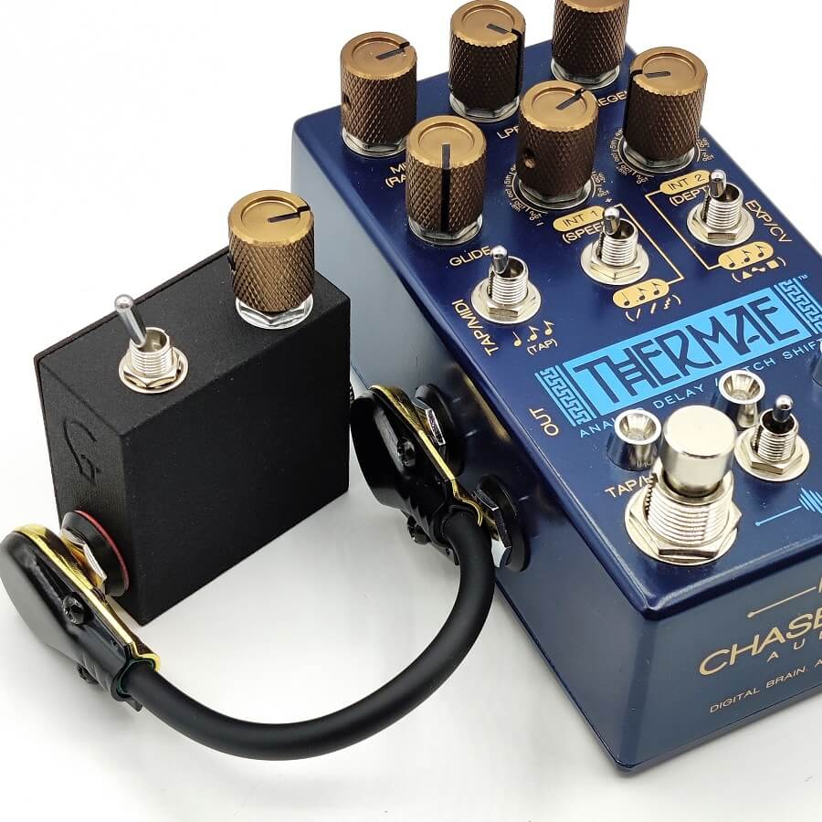
Thermae Expander
Add a Time knob to your Chase Bliss Audio Thermae pedal and also some other functions.
Showing all 8 results
-
Attenuator Knob
30,00 € Add to cart -
CXM Dust Cover
28,00 € Add to cart -
Echo Knob
85,00 € Select options -

Expression Knob
28,00 € Add to cart -
Thermae Expander
80,00 € Read more -

Thermae Time Knob
78,00 € Add to cart -

Tripl3X
65,00 € Add to cart -
WEX (Wireless Expression)
70,00 € – 135,00 € Select options